
What Makes a Color “Yours”?
Personal color, when chosen wisely, has the potential to make your face appear brighter, healthier, and more vibrant. At the same time, unflattering hues hold equal power to drain the “life” right out of you! Short of having a professional colorist in your closet each morning, there are things you can do on your own to look fabulous every day. Here’s some guidance.
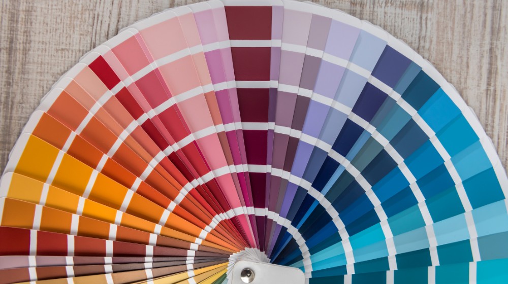
First, some color basics.
Three Characteristics to Look For in Choosing Personal Color:

1. Undertone (Temperature)
Colors can be primarily cool (with a blue undertone), or they might be predominantly warm (yellow based). Most people look better in one temperature over than the other.
When your clothing is in the same color temperature as your features, you achieve personal color harmony.
2. Intensity
This is what might be thought of as the power of a color. A color can be soft, with a muted or dusty finish. Alternatively, clear colors are at the other end of the spectrum with strong saturation, or brightness. For some skin tones or hair/eye combinations, intensity is the most important quality in personal color. Achieve harmony by wearing colors in the same intensity as your own features.
3. Value
A color’s value can also be described by its depth (or darkness). It may be light or deep. This quality relates to the wearer’s personal color contrast level. For example, dark hair against light skin represents “high contrast,” where skin and hair that are close to one another in depth are in “low contrast”. When you wear clothing in color values that relate to your own contrast level, you allow the clothing to support you, rather than compete with your natural coloring.


How well do you see color? Take the Color IQ Test.
Simple Strategies to Make Color-Wise Choices for Your Next Knockout Look:
1. Use your eyes and hair color as personal color neutrals. Neutrals don’t have to be black, white, or navy. Your own neutral colors might be deep olive, or brick red. (Look closely when examining eye color – there’s more than one hue in there! Check out all of the flecks and “spokes.”)
2. Let your Mother Nature-bestowed pearls guide you. When you purchase your next basic white shirt, see that it relates to the color of your teeth or whites of your eyes for optimum flattery. (If your teeth are a creamy version of white, you can bet they’ll look yellowed against the coolness of a bright, pure-white shirt.)
3. Determine whether your skin undertones are cool or warm, and choose garment hues accordingly. DIY home test: Take 4 sheets of construction paper, or fabric if you have it, in brown, black, white, and cream. Alternately hold each up to your face In front of a mirror. (Smile while you’re at it!) If you’re cool based, the white and black will be the more-flattering set. A warm-base is flattered more by the brown and cream. Hint: Look for unevenness in skin tone; dulling of the eyes, or extra shadowing in facial creases as indicators when evaluating your own personal colors.
What are your experiences with color? Let me know or ask me a question!
Watch for my next blog post where we’ll explore building a wardrobe around your personal color palette!
Want to learn more? Work with me.
Patty Buccellato is an image coach and founder of Refined Images. She brings extensive knowledge and expertise to her work with men and women individually, as well as with corporate employee groups.
Patty established Refined Images in 1994, and while her studio is based in Rochester Hills, Michigan, you’ll find her serving clients throughout North America in their homes, offices (normally), and… well, now on Zoom! To get your FREE copy of Patty’s eBook “The Wardrobe Simplifier” visit Refined Images or contact Patty.
Go here to claim your FREE eBook!
Connect with me!
